
THE JARGON
A quick word about graphic designers: they handle a lot of jargon on a daily basis. While we won’t go over the hundreds of terms they “might” use throughout the course of a week, here’s a quick guide to help you understand what they normally use on a daily basis…
COMPOSITION
This is how your elements are composed on the page. For example, if you have text and images, the composition will affect where the reader’s eye is drawn to first, so it’s important to make sure the artwork has a suitable layout to highlight the most important point you want to make.
BLEED & SAFE ZONE
This is a technical term which relates to how the artwork document is set-up in design programs & applications. You need a bleed area and a safe zone, usually 0.125″ each, around the edge of your document. That’s 0.125″ extra on the outside of the artwork (the bleed) on which the background image or color is extended, and 0.125″ inside that (the safe zone) where no graphics or text should sit, to avoid being cut off. This is because commercial printers don’t just print to the edge of the paper: they print on slightly larger sheets of paper which are trimmed to size after the printing is complete.
If you have anything important in your bleed or safe zones, there’s a chance it could be cut off!
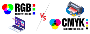 RGB -VS- CMYK
These are the most common color spectrums used by designers. For online work, RGB is most common as this most accurately reflects what you can see through a computer screen. This is because RGB is an additive spectrum, where colors are added to a black background (such as the pixels on your computer monitor). There are thousands more color options in RGB than in CMYK.
When requesting designs for use Online only, such as a website, social media, etc, let your designer know so that they can design in RGB only. If requesting designs for Print only, such as Newspapers, Magazines, Flyers, Posters, etc, let your designer know so that they can design in CMYK only. If you’re requesting graphics for both Online and Print, it is highly important to let your designer know so that they can make necessary adjustments to the Artwork and send you 2 sets of files; one set for Online use and one set for Printing…there will be a noticeable difference between the two as you’re viewing them on your computer screen.
CMYK is most commonly used for print media. It stands for: Cyan, Magenta, Yellow, and Key (Black), which are the four color inks used to build a printed image on large scale commercial printing presses. CMYK is a subtractive spectrum, meaning colors are used on a white background to filter other colors out of the visual spectrum. There are additional colors on commercial printing presses; Light Cyan, Light Magenta, and White are the most common, but these don’t have anything to do with the design itself, it is how the printer adjusts for specific colors.
CMYK has a smaller range of colors than RGB. It might seem strange to restrict printing to a smaller color spectrum than RGB, but in fact it helps to standardize the colors across all printers for a high-quality output, regardless of where you go to get your printing done.
Remember that when you check the artwork your graphic designer sends over that your office printer probably prints the RGB spectrum (as most desktop printers do). This means the colors may not quite match up to the final printed product, as the artwork your designer has created will be in CMYK. So just keep that in mind when reviewing your Proofs. It’s not out of the question to ask your designer for a physical sample of your printed graphic, if they are able to provide one.
WHITE SPACE
This is, very literally, the white space on the page. It’s really important for any designer to understand how to use white space effectively, as it can draw the eye where it needs to go, as well as prevent artwork from feeling cluttered.
GRADIENT
A gradient is where one color fades into another color. Sometimes it’s very subtle, while other times you might have a rainbow of colors fading into each other. It’s particularly effective on digital designs, but can be done well in print, too.
 TYPOGRAPHY
This refers to the fonts your graphic designer uses. It covers the, spacing, font, and typesetting of your text, and is an important skill for graphic designers to be confident with in order to produce high-quality work (otherwise you may end up with fantastic images but text which doesn’t seem to ‘fit’ with the style or branding).
RESOLUTION & DPI
The resolution of images is really important when designing artwork for print, and your graphic designer knows this. If they ask you for a high-resolution image to include in their artwork, they mean that you need to send them something with a resolution of at least 300dpi, a higher resolution is preferred (600dpi or 1200dpi usually).
DPI stands for dots per inch, meaning the number of dots of ink on the paper per inch during printing. So the more dots there are per inch, the higher the resolution will be. This is really important when sending artwork to print, as a low DPI will result in fuzzy final printed images.
If you’re asked to check a proof before sending it to print, a good way to check the resolution is to zoom in to your document by 300 – 400%. This will reflect the quality at which it’ll look once printed on paper.
VECTOR ART
This is a term used a lot. If you have artwork you’d like to use in a new composition, such as a Logo, Mascot Icon, etc, and want to have it be as big as your house, that artwork needs to Vector in order to size it up big enough without losing quality. Flat JPGs, PNGs, GIFs, etc are not editable and can’t be used for anything outside their intended use, unless they’re already big enough and don’t need to resized. Even some PDFs are not editable depending on how they were saved. Once you provide such files, your designer will be able to let you know whether or not they can use the file(s). “Vector Art” file formats are usually in AI, EPS, SVG, etc.
 IN CLOSING
Understanding the “Jargon” and communicating your specific needs up-front are the most important keys to a great design, smooth & quick process, and your overall satisfaction. Your designer is at the mercy of the information you provide at the beginning and can only design based on that. If your communication isn’t fully clear from the get-go, there will be a lot of back and forth with design revisions and talking passed each other. This will not only lead to extra costs and wasted time, but will ultimately lead to a lot of frustration for you and that means you won’t be 100% satisfied with your designer and/or the finished design.
So, in order to save you time and money in the long run; before you request an estimate from a design company, try to have full clarity on what exactly it is you’re looking for, whether you need it for online-use, printing, or both, and maybe find some sample art on Google Images or take some photos of things you’ve seen out somewhere that you really like. Having a complete and detailed explanation, as well as possibly some visual samples, of what you’re looking for will help your designer create a few concepts for your review rather quickly, and that will lead to quick turnaround and complete satisfaction. It’s a win/win for everyone!